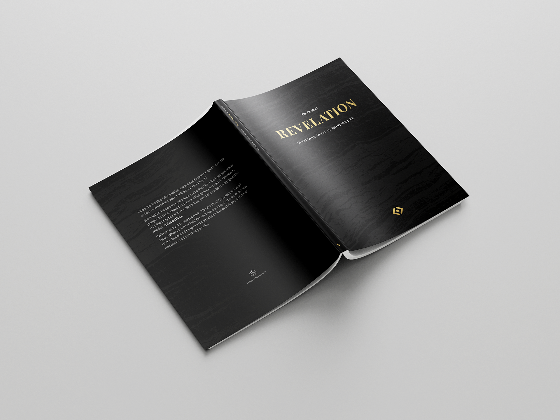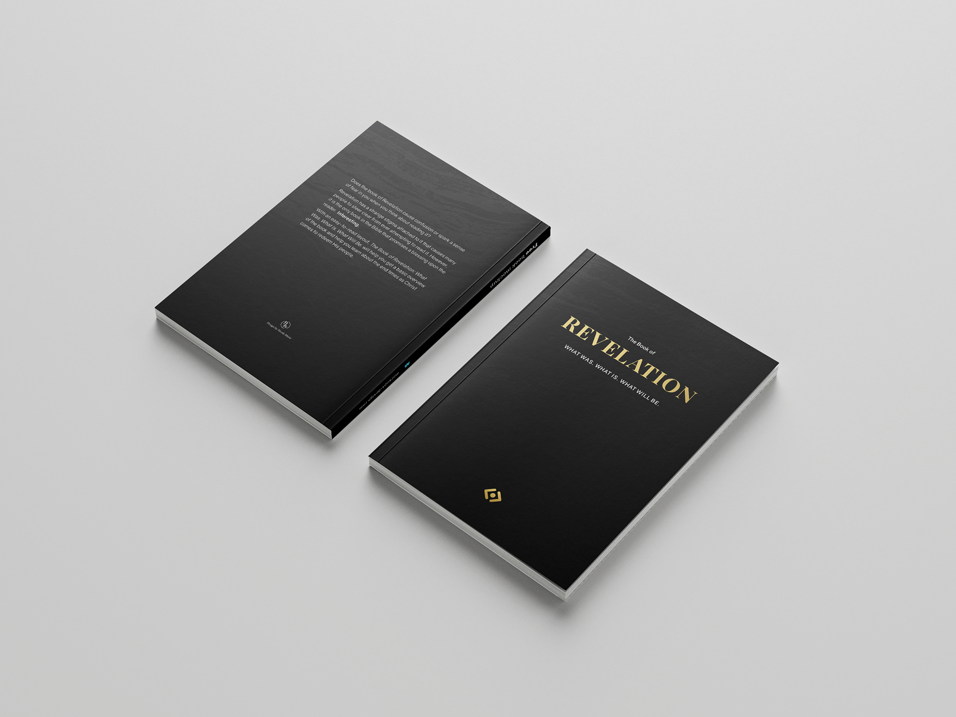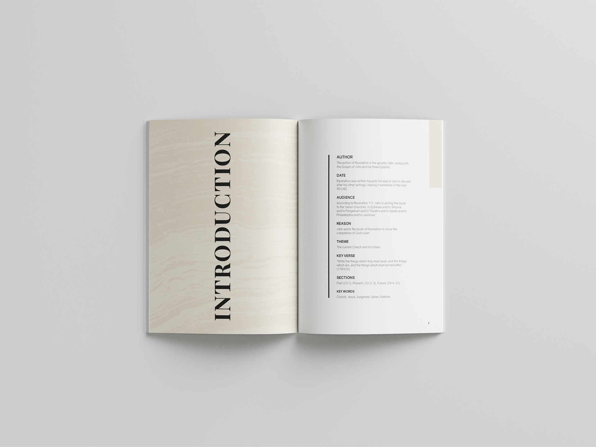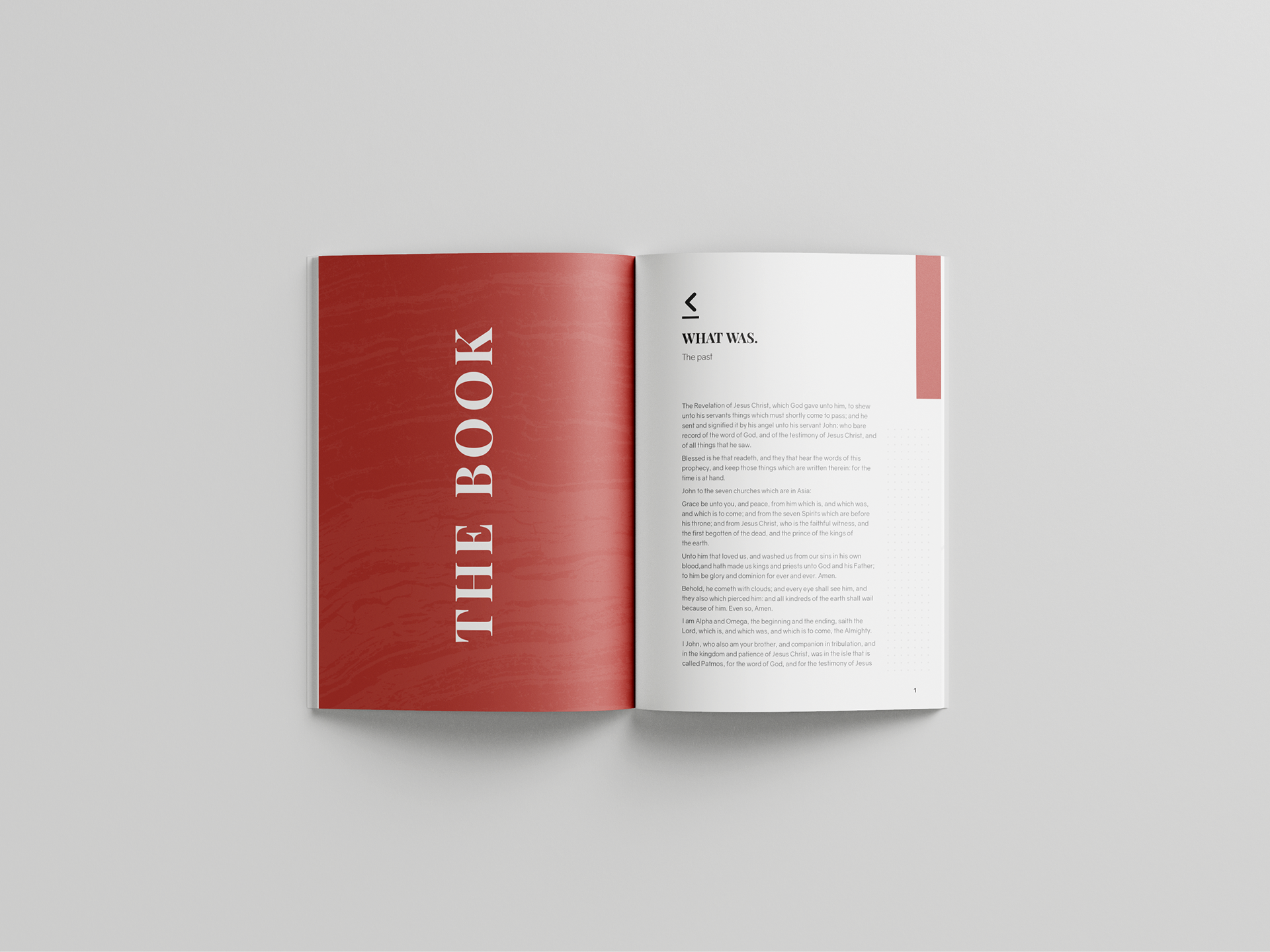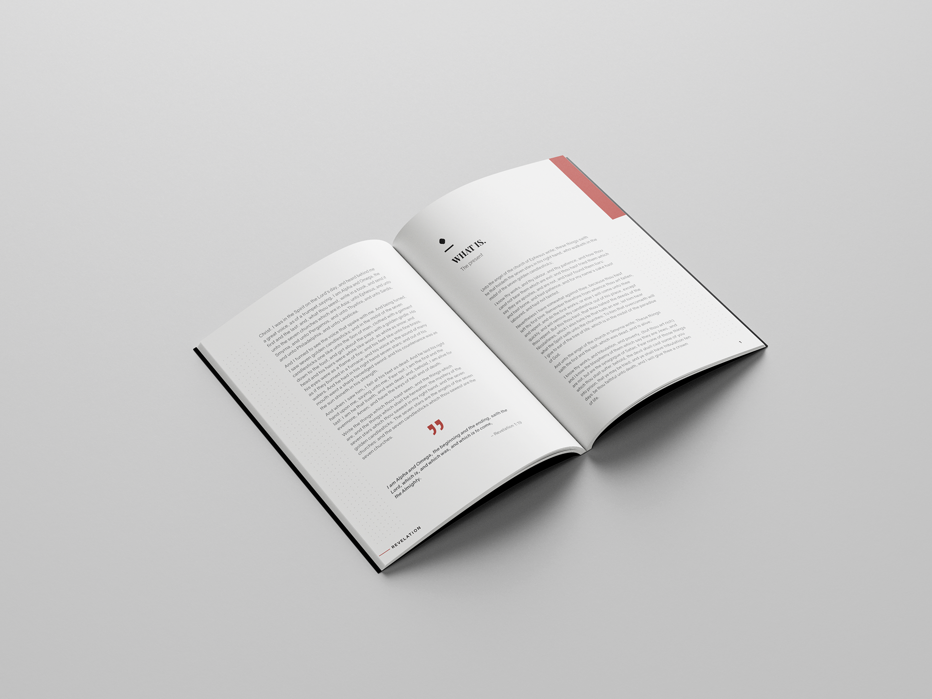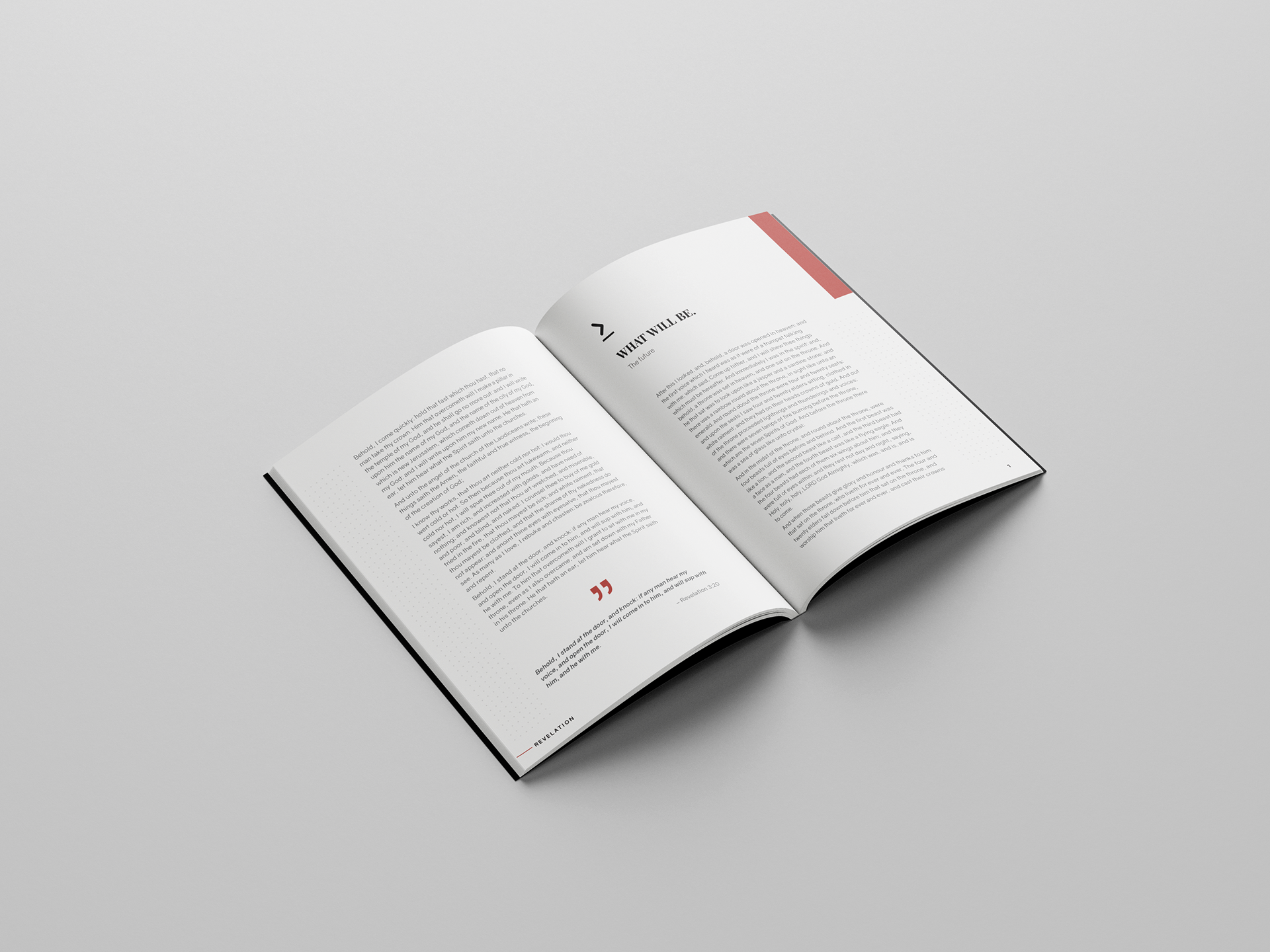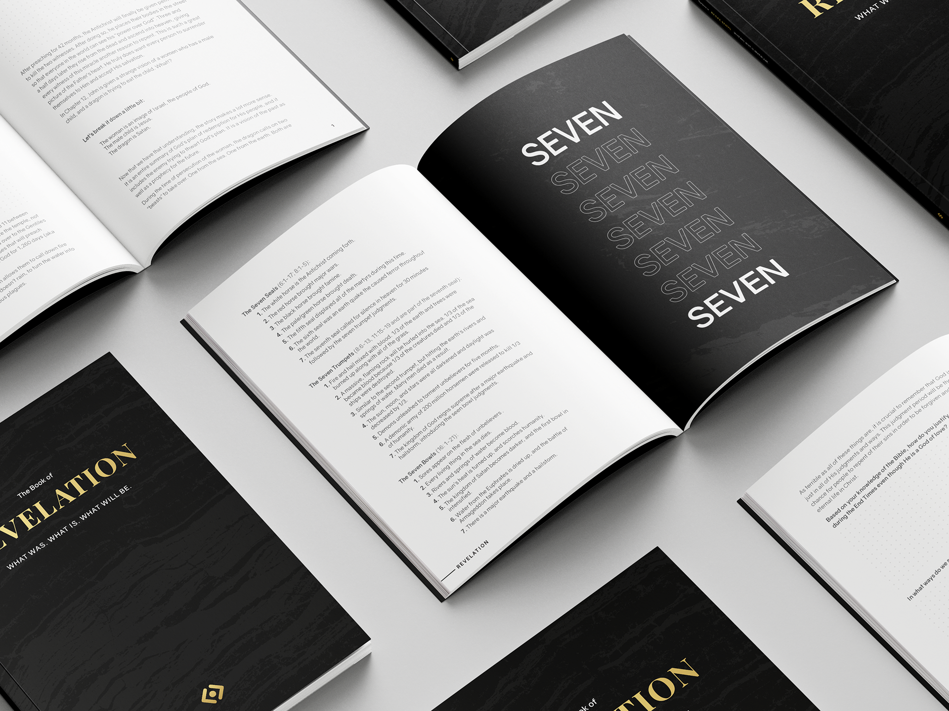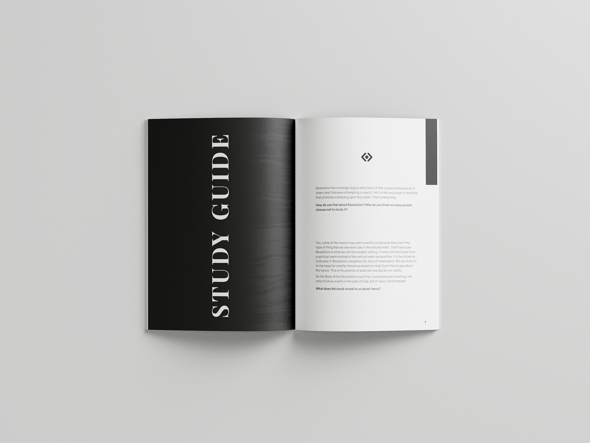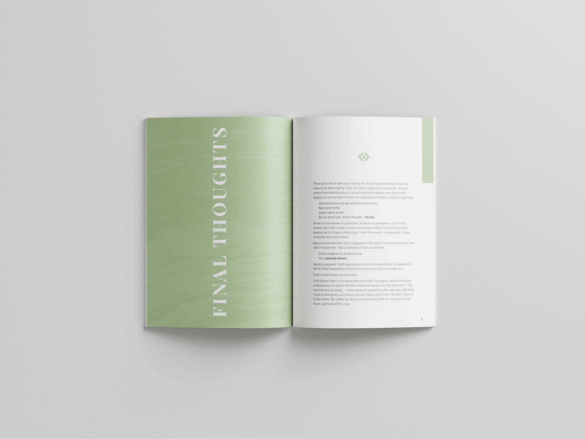


This is 9”x 6” 60–paged publication. I redesigned the book of Revelation in the Bible for a class project. Every design choice was inspired from the book of Revelation. First, I gave the book a slogan based off the content in the book, “What Was. What Is. What Will Be.” I then gave that slogan a symbol – an arrow point backwards, a period stating the present, and an arrow pointing forwards. Next, I broke the book down four sections: Introduction, Text, Study Guide, and Final Thoughts. This way the reader can easily navigate and study the whole book without running into little text and hard to understand content. The colors I chose for each section are based off the four horses explain within the book: the white, red, black and pale green. Within the text portion, I continued to break down it’s content with the symbol so the reader knows which part of the book they are reading. I left extra space on each side of the page for note taking. This book was designed to help those who want to read and study the end times. I accomplished this by creating a simple layout with white space and big text with the use of graphics to create interest. All design elements and layouts were designed in both InDesign and Illustrator.
